
A Sports Network With A Fervent Fanbase

CLIENT Big Ten Network

SCOPE Presentation Design, Presentation Strategy, Video Production

Big Ten Network, the network dedicated Big Ten Conference coverage, was one of the first TV networks devoted to a single college sports conference. The network works to develop deep brand partnerships with the sponsors and advertisers, giving them bespoke access to their unique digital presence and their immersive fan experiences within major conference games. The brand sought a partner to help develop better upfront presentations to compete with other major networks seeking deals.

THE CHALLENGE

BTN previously engaged with other presentation vendors and wanted to find a partner that could bring a fresh perspective to the execution of their presentations. The brand needed to stand out against ABC, NBC, and all of the other major networks that are courting similar advertiser relationships. BTN brings a fervent set of 21 million conference fans and needed a way to promote the value of this access to possible brand partners. They’ve also recently revamped their digital strategy, finding new ways to integrate brands into more content throughout the fan experience.

THE SOLUTION

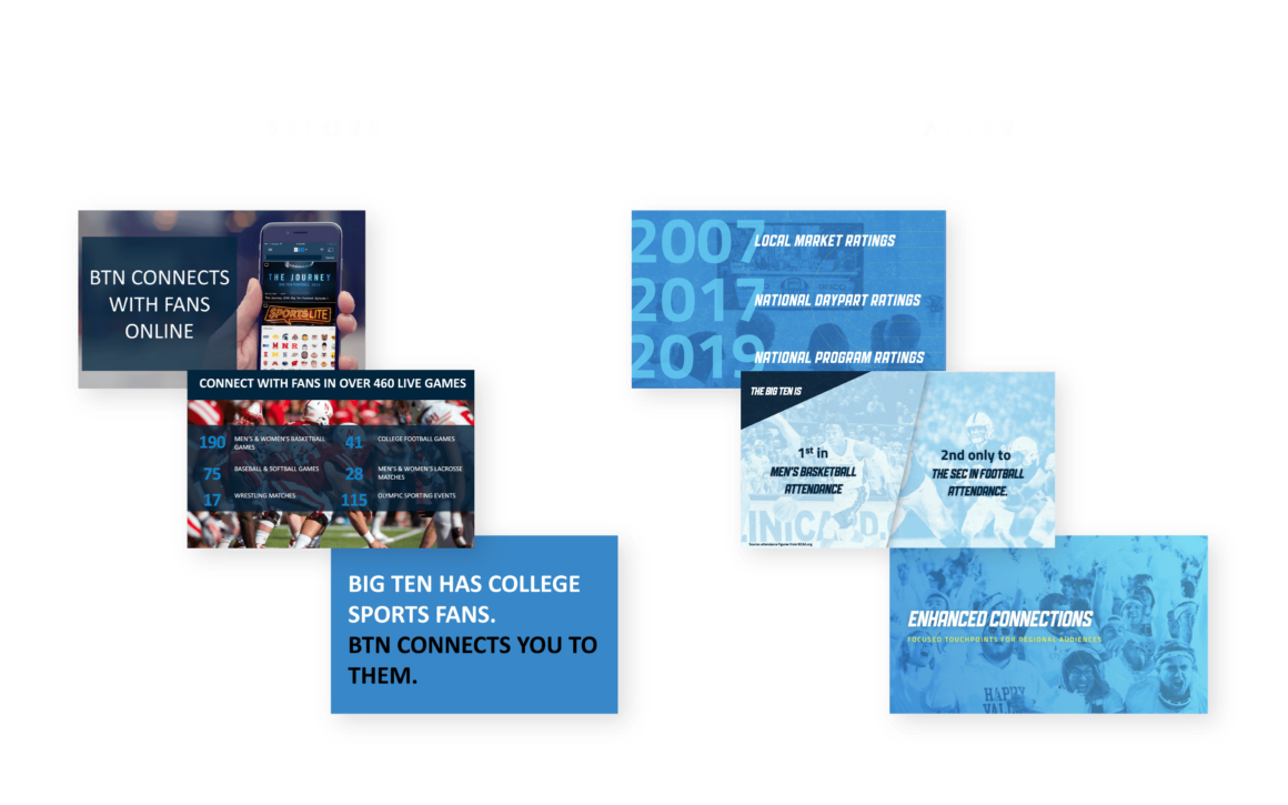
We worked alongside their sales and marketing executives to develop a cohesive and effective content structure for the presentation. BFP developed a scalable presentation structure that could be delivered by the BTN team. After several iterations from the design team, we developed a unique look and feel that pushed the brand forward while ensuring overall brand consistency.  By visualizing their brand offering structure, BTN had a clear way to immediately explain the benefits and options to potential partners.

Full Project Overview

60 Million Homes Nationwide. BTNSMG reaches fans across the nation.

Robust Style Direction

With a brand that needs to speak both to the excitement of the sports atmosphere and the digitally-focused brand experiences, we developed multiple options for the BTN to take from a visual branding perspective.  
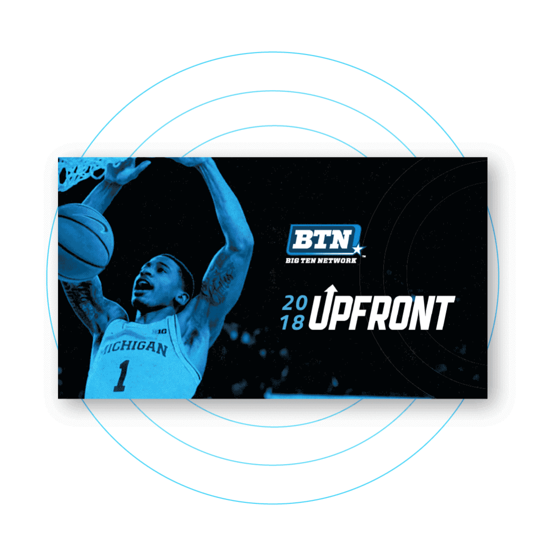
Bold and Energetic

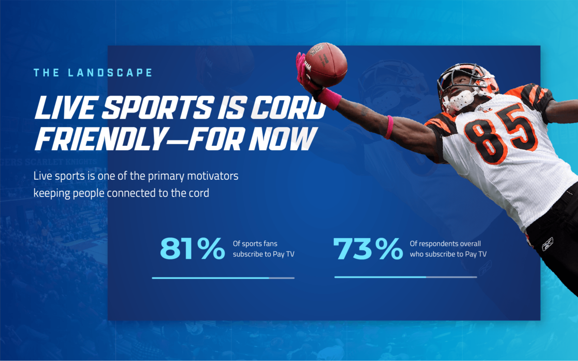
Using bold type and a color direction that screams “Big Ten Blue”, each slide is simple, yet captures the energy of what it’s like to be sitting in a major conference game.

Final Thoughts

It's super gratifying to see the difference in the brand and styling of the new presentation. I truly believe this revamped presentation will really take Big Ten to the next level.

Bo Kim
Interactive Designer

I'm happy we could provide a presentation filled with the energy of the conference fused with a modern approach to visuals.

Ebony Smith
Brand Strategist
Ready to make an impact?

Get In Touch

Check out our book!
x