5 Valuable and Highly Effective Prezi Tips
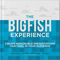
Preorder our new book, “The Big Fish Experience” to see everything we’ve learned over the years, all the resources we use to do what we do, and our tips on how to present experiences.
There’s a shift occurring in the presentation world.
It’s been happening slowly, but is picking up pace as people are beginning to “get” how important presentations really are to your business, organization or brand.
As this shift takes place, new tools have emerged to facilitate growth in the presentation industry.
One of these tools is Prezi.
Prezi has emerged as an excellent tool in presentations because it makes them fun and engaging. At Big Fish Presentations, Prezi is one of our requested creation tools, and it has had a tremendous impact on the way we think about and create presentations.
Over time, through many projects and countless discussions, we have learned a few things about how to improve your experience with Prezi.
Here are a few tips to help you out in your next presentation.
1. Utilize Perspective
Unlike Powerpoint, Prezi is a very diverse in its movement and transitions. Instead of keeping your audience in a tiny box, Prezi literally has the capability to take viewers outside that box and take them on a ride.
If used correctly, Prezi can be an adventure, an exciting display of color and designs that your audience will truly enjoy. We use perspective in our “Presenting An Experience” presentation by zooming in and around the screen. Notice how the perspective changes dramatically at times. This gives depth to your presentation and allows your audience to enjoy the content instead of simply watching bullet points fade in and out.
(Note: Don’t be too crazy with the zooming and speed. See tip number 3.)
2. More graphics than words
A picture is worth a thousand words. This is a cliché, of course, but it absolutely applies in Prezi. An image can tell a story in many different ways than a group of words can. Slim down your content and enrich the meaning with a visual treat for the audience.
Create a centralized image that sets up a theme. Your audience will be more likely to look back on your presentation and recall that image. They will remember your story. In our presentation for Celtic Media Centre, we used the image of the projector screen to tie the whole theme of film together. The audience didn’t just see a set of points. There was character attached to the content, which is always more memorable and effective.
3. Control your movement
Use control in your zooming and flying around. No one wants to be taken for a ride so crazy that they have no idea what the points presented even meant. Find a balance of exciting movement and steady pace. Make sure that every time there’s a dramatic flip, there’s a reason for it.
Keep your movements simple and fun, not wildly experimental and nauseating. An example of a Prezi that uses a measured pace and dynamic movement is our Raising Cane’s presentation. Do you see and feel the rhythm we created? Keeping it light and wispy, but meaningful and rhythmic is crucial in keeping your audience’s attention while you make your points.
4. Incorporate outside programs (Photoshop, Illustrator, InDesign, etc.)
Don’t limit yourself. A Prezi made with only the tools provided within the program can often result in a bland, run-of-the-mill experience for your viewers. Incorporate things that can’t be done in Prezi to enrich the experience. Your audience deserves it.
How?
Use creative programs like Photoshop, Illustrator, and InDesign for rich graphics and professional quality design. For a video, use iMovie, FinalCut, or Adobe Premiere to give your audience the experience that best displays your brand, organization, company, etc. We incorporated video in our work for New Orleans Entreprenur Week , and it worked very well to diversify the presentation. Our audience was able to sit back and enjoy a video for a few minutes before moving on to the next point. High-quality design and video heightens aesthetics and boosts your audience’s morale.
5. Choose a color scheme and be consistent
Prezi is very user-friendly, but this can be a bad thing. Oftentimes, people with little or no design experience create presentations that incorporate mismatched and, sometimes downright ugly, color schemes. It’s imperative that you not only choose a color scheme, but that you stick with it and maintain a consistent theme throughout your presentation.
Choosing the color scheme can be difficult if you aren’t sure which colors work well together to convey certain points. However, there are loads of sites to help with color choice. Our team of designers chooses color carefully and works with our copywriting team to produce the most appropriate and effective combination. See our Blue Cross Blue Shield presentation for an example of a consistent color scheme.
These are simply tips, not commandments. Feel free to do with them what you’d like. We have found that they work for us, and our customers have come back for more because we integrated these techniques into our work.
So, what do you think?
Were these helpful?
We hope so. If you’d like more tips for Prezi or general advice, please leave us some questions below, tweet us, or post on our Facebook!
Happy presenting!
-Big Fish Presentations


Share your opinion.