The Essentials
The Presentation Programs for the Everyday Presenter
For our final Christmas Gift to our readers, we offer the next post in our The Essentials series. We are featuring presentation program resources that bring your design to life.
If you don’t have time to scour websites for photos and fonts, here are easy design programs + companies that can help you create presentations quickly.… Continue Reading →
The Essentials
Design Resources for the Everyday Presenter
Continuing our Christmas Gifts to our readers, we offer the next post in our The Essentials series. For the second part of this series, we are featuring design resources that anyone (those who aren’t designers by nature) can use.
If you are planning a slideshow presentation and would like to include photography/illustrations in your slide decks, here are three sites we recommend for design information, and five web resources for free and paid photography and graphics.… Continue Reading →
Content + Delivery Resources for the Everyday Presenter
As an early Christmas gift to our readers, we offer the first post in our new series The Essentials. We will feature compilations of our favorite posts that we recommend to everyone looking to improve their presentation game. For the first part of this series, we are featuring creating great content and powerful delivery.… Continue Reading →
For many people, the new year means setting new goals and challenging themselves to be even better than the year before. Here at Big Fish Presentations, we believe challenging yourself to step out of your comfort zone is one of the best ways to create presentations that not only inform your audience, but captivate them as well.
So, this year we decided to help you get creative by compiling 10 challenges from our latest book, “The Big Fish Experience,” in the list below.… Continue Reading →
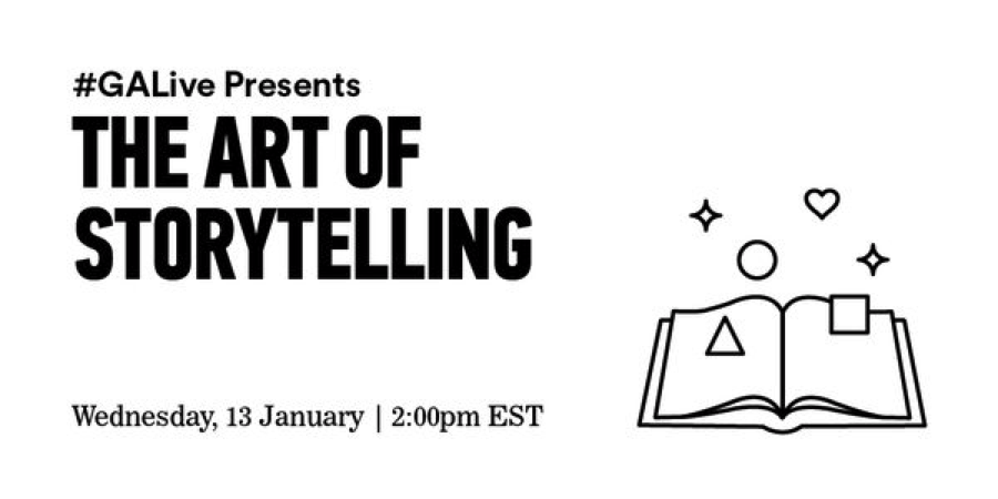 Last Wednesday, we had a wonderful time moderating a webinar called The Art of Storytelling with our friends Dave Kerpen of Likeable Local and Brittany Hodak of Zinepak at General Assembly. Our goal was to share tips on the fundamentals of storytelling, how those fundamentals apply in our digital world today, and what it means for our future.
The webinar was a hit on Twitter and we received many emails asking us to share the video. … Continue Reading →

At BFP, we believe that great content must be accompanied by great design in order to deliver an all-around memorable experience. Our motto is, “Content is King, and Design is its Queen.” Below are some examples of before & after slides that deliver powerful content in two different ways. We’ve done this to show that design can allow the audience to better experience content when they’re ingesting material with clean design.… Continue Reading →

Color is one of the most important components of visual communication. Humans recognize color and process it in their brain before they are consciously aware of seeing it. Each color represents a different meaning and affects us at the most basic human level. An onlooker might look at a design and think that a color was used because it looked good, but an experienced designer knows that there is a lot more that goes into choosing a color.… Continue Reading →
Preorder our new book, “The Big Fish Experience” to see everything we’ve learned over the years, all the resources we use to do what we do, and our tips on how to present experiences.
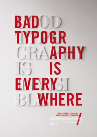
It may be something we often overlook, but typography plays an essential part in the presentation process. Each logo we see is specifically designed with a font to fit the brand.… Continue Reading →

Have you heard of The Rule of Thirds?”
Unless you’re a designer, photographer or an artist, you probably don’t hear about it a lot. It’s a standard in the design world, used by professionals in many fields in order to achieve harmonious, clear placement of a variety of design elements. It’s a basic rule that, if followed correctly, greatly increases the value of images and text in any piece, (including a presentation) and the good news is that ANYONE can do it!… Continue Reading →
Here’s a clip of our CEO/Founder being brave and presenting to a crowd how to deliver a presentation on presentations…without a presentation. Darn technical mishaps. In the clip below, Kenny speaks about simplistic design, passion, and his story of entrepreneurship. Check it out:
[youtube=http://www.youtube.com/watch?v=eiZJCaOIZdU]
Note to self…always have a backup plan as the show must go on.… Continue Reading →