5 Key Principles of Using Photography in Presentations
A picture is worth a thousand words. But what does that mean? Images are powerful and emotional. One image can tell an entire story. Images stir curiosity and engage an audience that wants to be entertained. In a presentation, images create an experience and leave a reference visual for your audience to remember in the future. Using photography in presentations can be tricky if it isn’t used correctly. Here, Big Fish makes it easy to understand the five key principles of photography to make your presentation worth viewing.
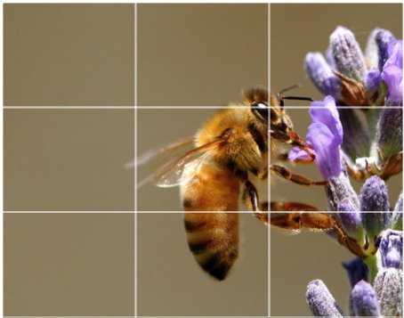
1. Rule of Thirds
One of the most well known principles of photography and one that is most important is the rule of thirds. The idea is to break down an image into thirds (vertically and horizontally) so that the image has nine parts. The goal is to place the image’s points of interest at the intersecting lines. Studies have shown that viewers’ eyes naturally veer to the intersection points rather than the center, allowing for a more balanced photo that enables the viewer to interact with the image more easily. You can read more about the rule of thirds on a past Big Fish blog here: https://bigfishpresentations.com/2012/07/25/presentation-design-the-rule-of-thirds/
 2. Depth of Field
Depth of field can be difficult to understand and execute for an untrained photographer. It is the amount of distance between the nearest and farthest objects that appear in acceptably sharp focus in a photograph. The subject in specific focus in front of, behind, or around its out of focus surroundings determines depth of field. Depth can be shallow or extended, depending on the subject. Many things can influence depth of field including camera settings, focusing distance, aperture, and even print size. Depth of field allows for a deeper focus and stronger subject setting in your images.

Shallow depth of field

Extended depth of field
3. Natural Photography
The best way to get an audience to understand your images is to have your photography look natural. Stiff and staged photos seem unrealistic and form a disconnect for the viewer. Candid photos that are taken in everyday environments are likely to make a larger impact and allow your presentation and the idea you are pitching to seem more relatable. When trying to capture natural photos, guide your subjects in the direction of what you are looking for, but don’t micromanage the photo-shoot. Let the instinct of your subjects form the image intuitively.
 4. No White Backgrounds
There are many pros and cons of using stock photography in presentations. They are usually low cost, quick and easy to access, and provide a wide variety of images to fit your specific need. On the other hand, they are often predictable and used by many people in your same field and hinder your presentation design. Focus on getting natural photos (see above), and always be sure to never include the typical white background attached to a stock photo. A simple fix of deleting the white layer in Photoshop makes all the difference.

5. High Quality
Having a high-resolution photo drastically changes how your image will come across. A pixelated image across a large screen makes your work look sloppy, and you can lose credibility. Be concise when using images, and be sure to try your presentation on several different platforms in case there is a need to choose a new image. A simple rule of thumb is that images should be no larger that 1600 x 912 pixels. Always use good quality, high-resolution images to insure a high quality presentation.

Follow these principles of photography, and your presentation will be sure to tell an amazing story every time. Want to know more about the wonderful world of presentations? Subscribe to our blog for all the latest tricks and trends in the industry.
Sources:
http://digital-photography-school.com/rule-of-thirds/
http://www.mir.com.my/rb/photography/fototech/htmls/depth.html


Share your opinion.