5 Reasons Why Typography is Powerful
Preorder our new book, “The Big Fish Experience” to see everything we’ve learned over the years, all the resources we use to do what we do, and our tips on how to present experiences.

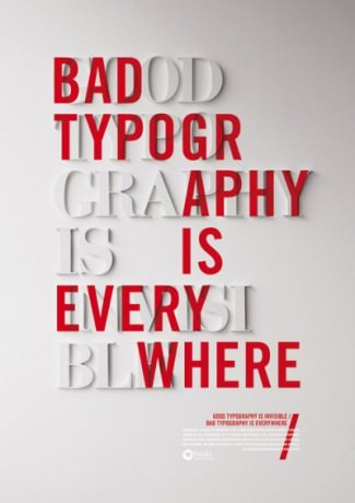
It may be something we often overlook, but typography plays an essential part in the presentation process. Each logo we see is specifically designed with a font to fit the brand. Typography can change the entire look and feel of a presentation, which is why we decided to provide five reasons why typography is so important.
1. It attracts and holds the audience’s attention.
Used correctly, typography can convey a certain mood or feeling. The audience needs to understand what message you are trying to send and be interested in it. Having the appropriate font sets the tone for your presentation before you even begin.
2. It is reader friendly.
Using fonts that are clean and easy to read are key to any presentation. If fonts are too small or cramped together, your presentation will be immediately ignored. It is fun to have a cool and complex project, but the audience should be able to easily comprehend what your presentation is saying.
3. It establishes an information hierarchy.
By using different font sizes and types of font, the audience can determine the most important points of your presentation just by looking at it. This makes it easier for your audience to follow along and pay more attention to your presentation.
4. It helps to create harmony.
Typography used throughout a presentation unifies it. Repetition of the same font in your presentation creates continuity and simplicity. Keeping your fonts aligned and in proportion synchronizes your presentation and keeps it uncluttered.
5. It creates and builds recognition.
The fonts you use in your presentation are the visuals that your audience will remember most. You want your audience to be able to recognize your company’s brand at any place or time. Typography marks your company and is the one thing the viewer will identify with time and time again.
See our SlideShare demonstrating powerful use of typography here.
How do you use typography to improve your presentations? Leave a comment and let us know! And don’t forget to subscribe to our blog for even more great presentation techniques.
October 14, 2013: check out our blog post in slideshow form!
[slideshare id=27173687&doc=5reasonstypographyispowerful-131014104049-phpapp02]


Share your opinion.