Why Your Design Needs Color
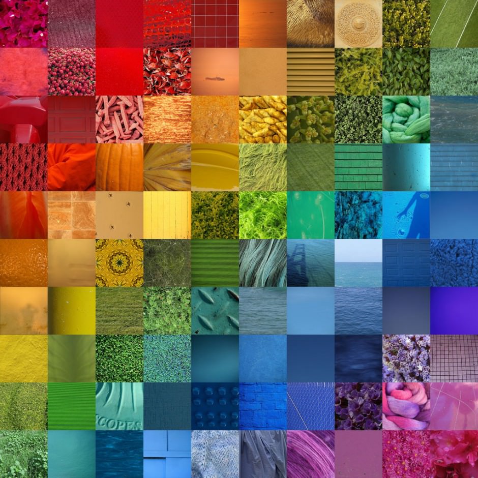
Color is one of the most important components of visual communication. Humans recognize color and process it in their brain before they are consciously aware of seeing it. Each color represents a different meaning and affects us at the most basic human level. An onlooker might look at a design and think that a color was used because it looked good, but an experienced designer knows that there is a lot more that goes into choosing a color. Big Fish decided to break down color and explain why it is so vital to design.
1. Color creates mood and emotion.
Color is used strategically in our daily life to convey different messages that we don’t even realize. We associate red with emergencies because red induces feelings of urgency and frightfulness, but most emergency rooms are green to create a calming effect and help us adjust to stressful situations. Jazz musicians call it “the blues,” because the color blue evokes feelings of sadness or aloofness. Yellow is the most visible color, which is why it is used on roads and pedestrian crossways. These thoughtful uses of color are just some of the thousands of ways colors influence us.
2. Colors create organization and structure.
What if you looked at a globe and the entire thing was one color? It would be extremely difficult to determine the ocean from countries, roads from rivers, and so on. You need colors to classify and arrange items in an order. Many companies, like FedEx and USA Today, use color on their websites to differentiate the services they provide. Color-coding makes it easy to distinguish one thing from the other to create clarity and convey information quickly.
3. Colors create identity.
Think about your favorite brands. Their logo immediately pops into your head. Why? Because of its color. Facebook and Twitter are blue. Netflix and YouTube are red. Starbucks is green, Livestrong is yellow, and Apple is white. All of these brands have an identity in your mind because of their color. Just think if Coca-Cola changed the color of their logo from red to purple. Would you go to a vending machine and look for a purple logo or a red one? Once we connect and brand with a color, it sticks.
The Big Fish team picked their favorite colors to see what each color said about their personality.
Alyssa Bordelon, Marketing and PR Intern, and Robert Kileen, Copywriter, chose green. This is the color of harmony and balance. Green symbolizes hope, renewal and peace. Green lovers are often affectionate, loyal and frank.
Kenny Nguyen, CEO; Gus Murillo, COO; Phil Roberts, Production Head; and Taylor Fairbanks, Account Executive, chose blue. This is the color of compassion and caring. Blue symbolizes reliability and sensitivity. Blue lovers are often faithful and patient.
Mitch Cobb, Creative Director, chose black. This is the color of dignity. Black symbolizes mystery and modesty. Black lovers are often artistic and perceptive.
Kristen Hinton, Marketing Director, chose red. This is the color of strength, vitality and health. Red symbolizes warmth and determination. Red lovers are often outgoing and impulsive.
Scott Holley, Account Executive, chose purple. This is the color of understanding and individualism. Purple symbolizes creativity and imagination. Purple lovers are often unique and strive to succeed.
Corey Schneider, Graphic Design, chose yellow. This is the color of happiness and wisdom. Yellow symbolizes clarity and precision. Yellow lovers are often humorous and adventurous.
When designing your next presentation, think about your target audience and how you want them to react. You can use color to influence their mood, help organize your presentation, and create an identity of your company in their minds. Think about the meaning of colors and how you can cleverly use them to benefit your next presentation.
Comment and let us know your how you feel about color. Make sure to subscribe to our blog for more articles on design and presentations!


Share your opinion.