4 Ways Design Can Make Your Content Shine
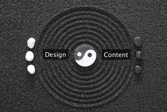
At BFP, we believe that great content must be accompanied by great design in order to deliver an all-around memorable experience. Our motto is, “Content is King, and Design is its Queen.” Below are some examples of before & after slides that deliver powerful content in two different ways. We’ve done this to show that design can allow the audience to better experience content when they’re ingesting material with clean design.
“Images can improve recognition and recall, and images combined with text can make for an even stronger message.” – Garr Reynolds, Presentation Zen Design (52)
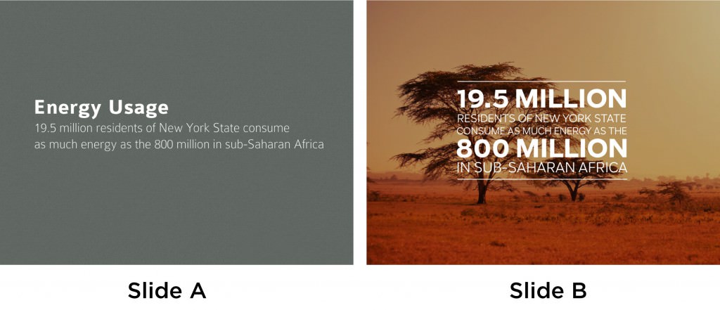
Slide A does a good job delivering a simple message about an important subject. However, Slide B’s image allows for the message to be driven home even further by supplementing the text with a powerful image. Keep in mind the image must be applicable. When using photography for your presentation ensure that the image is of the highest quality. Pixelated or irrelevant images can work against conveying your message.
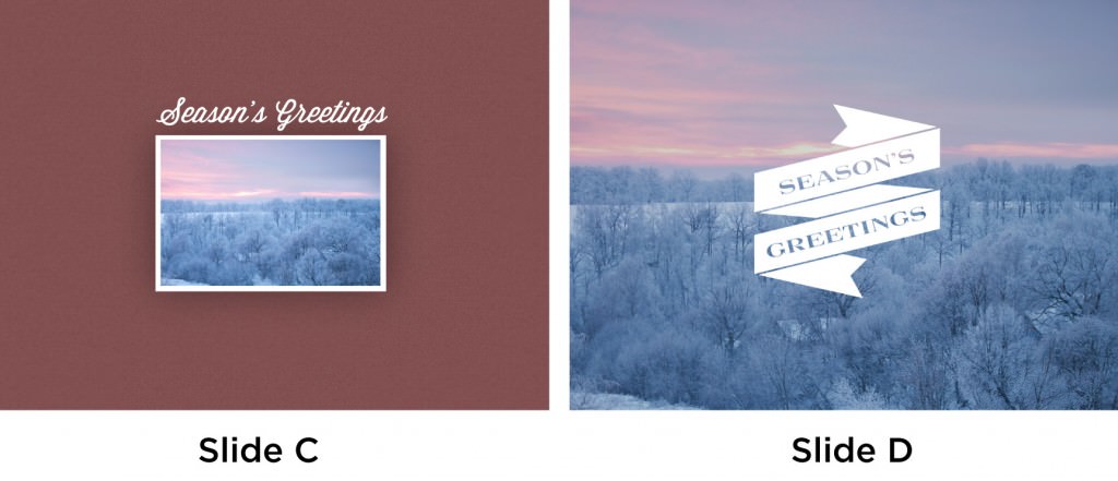
When using photography for presentations, larger and full bleed images allow for a powerful slide. Slide C is a very clean slide, but Slide D uses a full bleed image to convey the same message. Keep in mind that this technique cannot be used for every slide that includes an image. If there’s a minimal amount of text and the image is high quality, it’s sometimes a good option to use a full bleed photo.
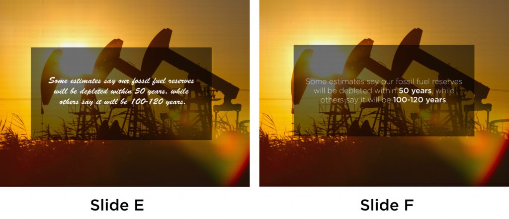
When designing your slides, remember to use a typeface that allows for maximum legibility. There might be a typeface that is well designed and unique, but if your audience is not able to read the slide, it will do more harm than good. Slide E has a unique type, but is less legible than the simple san serif used in Slide F. Slide F also highlights important data to let the reader know what information is the most significant on the slide.
“Simplicity is a fundamental tenet in all aspects of design and communication. It is especially important concerning the creation and display of quantitative information.” – Garr Reynolds, Presentation Zen Design (151).
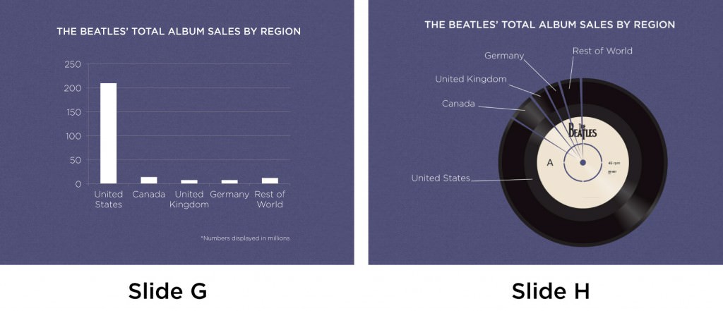
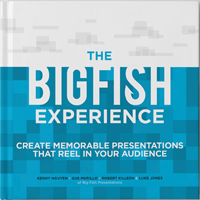
When conveying important quantitative information to your audience, there are many routes one could take. Slide G is a slide that takes this notion of simplicity and applies it to a very simple bar chart that allows the viewer to clearly see the data for what it is. This slide’s downfall is the wrong choice of chart. A pie chart would have allowed for the relationship between the data to be better understood. Slide H used the tool of photography to allow the reader to better apply the data in an image that is more memorable. Although more complex, this slide is still able to allow the viewer to ingest the information in a clean and concise way.
You don’t want to become dependent on your slides for a presentation; you want them to amplify it. So with these tips and guidelines, you can make sure your slides don’t become a crutch – so instead of giving a presentation, you create an experience. For more design and public speaking tips, check out the rest of our posts, and subscribe to our blog for more information .
For more presentation tips from Garr Reynolds, check out his presentation blog: http://www.presentationzen.com/
Update on 7/24/13:
For a visual presentation of this blog check out:
[slideshare id=24590349&doc=4waystomakeyourcontentshineslideshare-130724143931-phpapp01]


Share your opinion.